Hile
Hile: identity and packaging for an ice cream brand
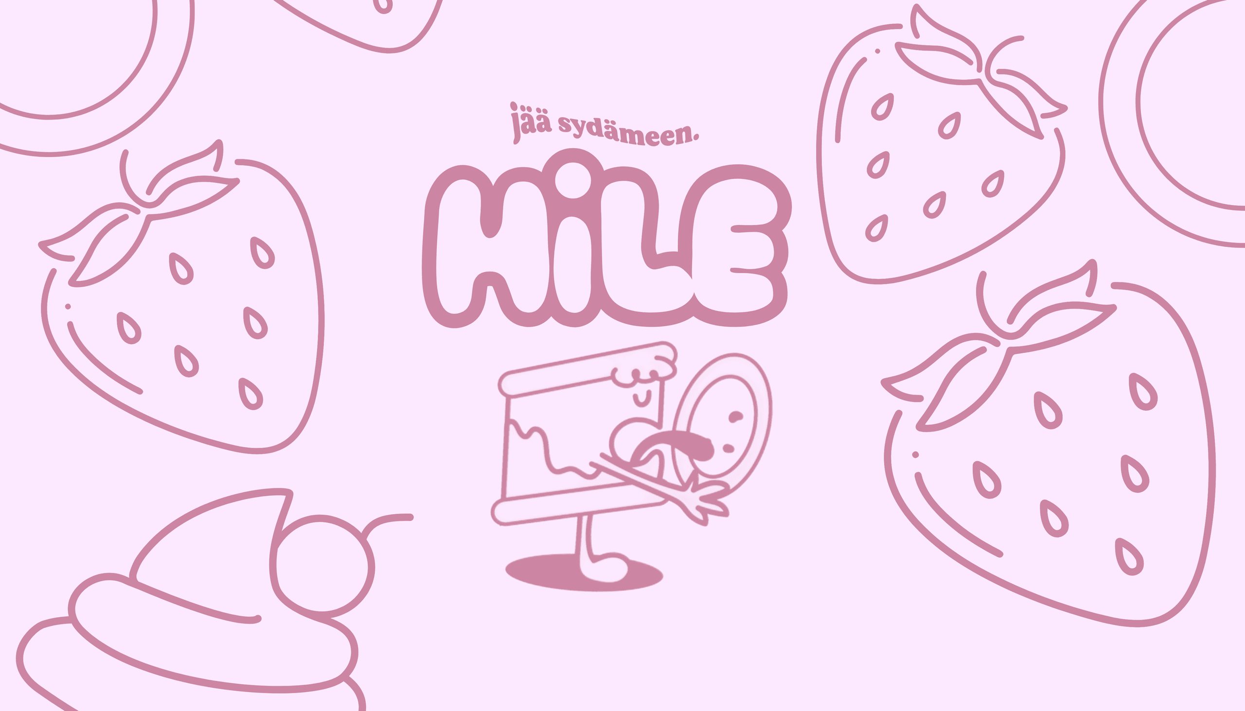
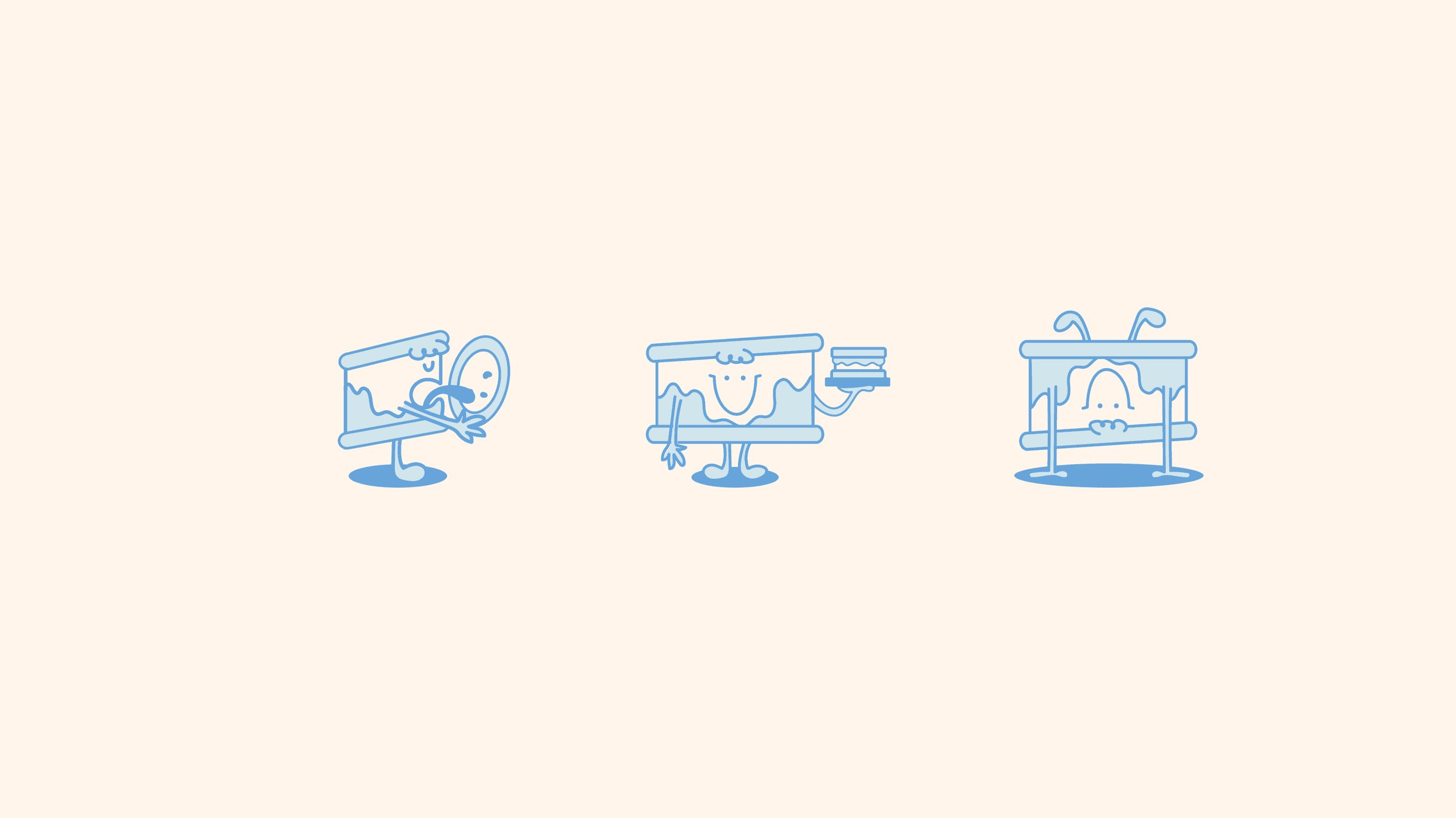
I designed the logo, slogan and packaging for Hile, a Finnish ice cream brand. The illustrations feature ice and frost crystals, reflecting the brand's name. The slogan “jää sydämeen” plays on the Finnish word jää, which can mean “ice” or “stays,” suggesting that the ice cream stays in your heart. Ice cream characters, simple line drawings and rounded typography give the identity a soft, playful look.
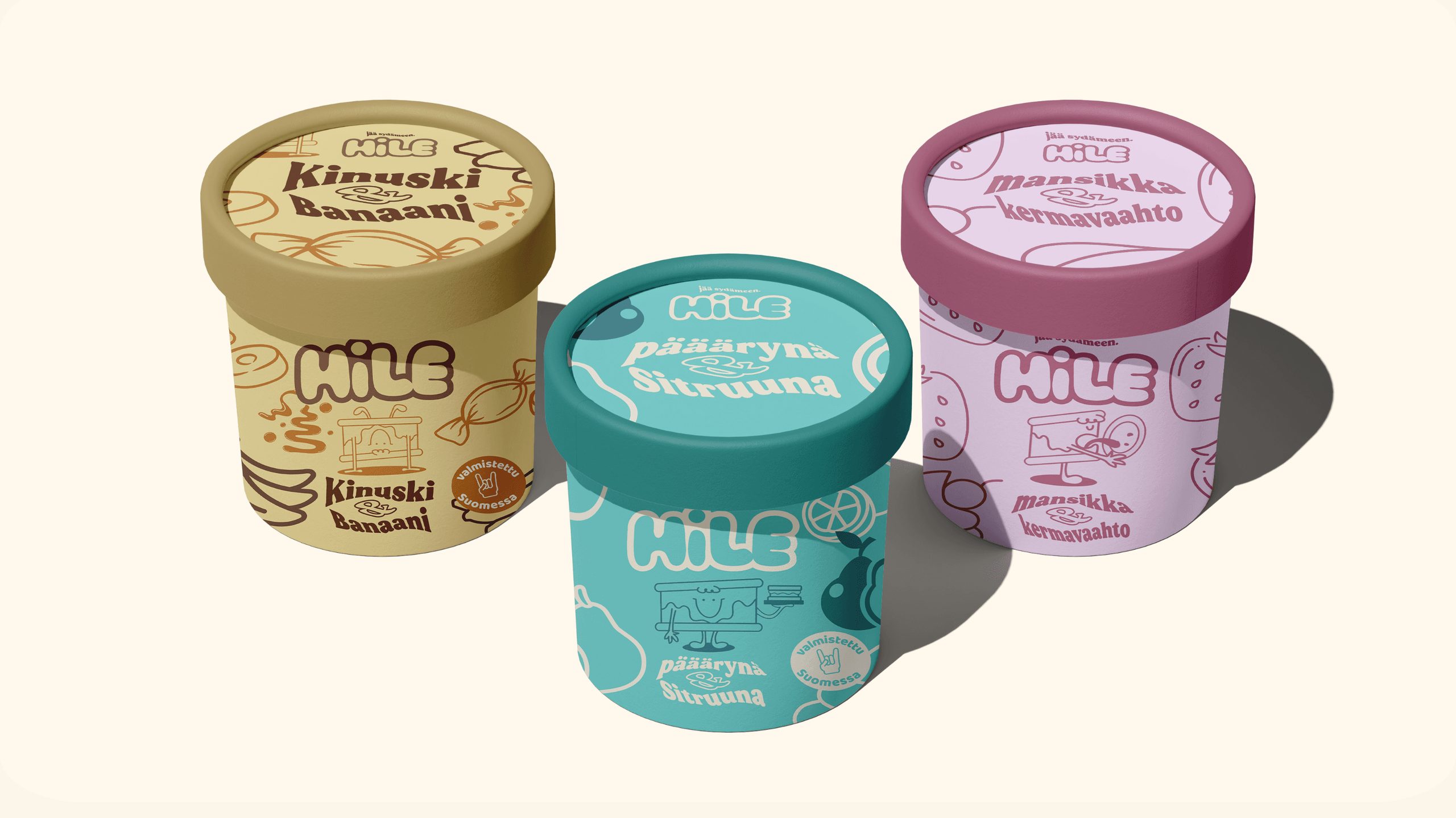
A color for every flavor
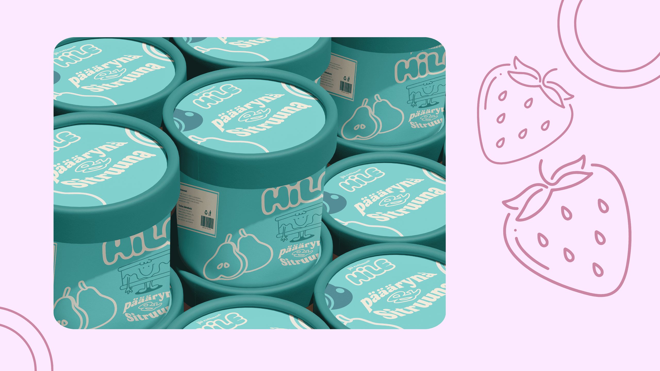
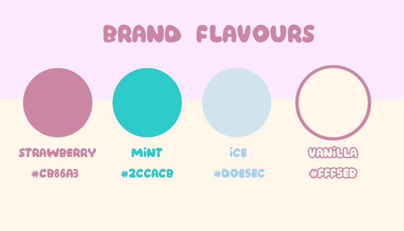
The packaging forms a product range with a different color for each flavor: pink for strawberry, turquoise for pear-lemon and golden brown for caramel-banana. The same characters, colors and line drawings also work on social media.
Tell me about your project. Let's talk about how I can help.
You'll find the prices on the pricing page. In a 15-minute call, we'll go over what you need and when you need it.
Page updated October 26, 2026.