KJS-Automaatio
KJS-Automaatio: logo and identity refresh
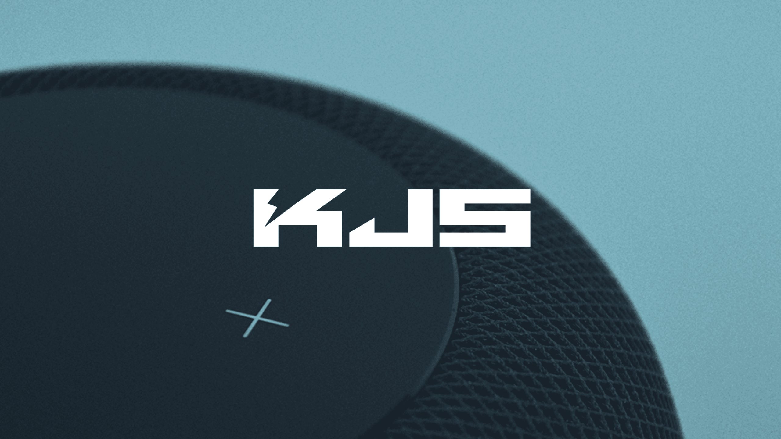
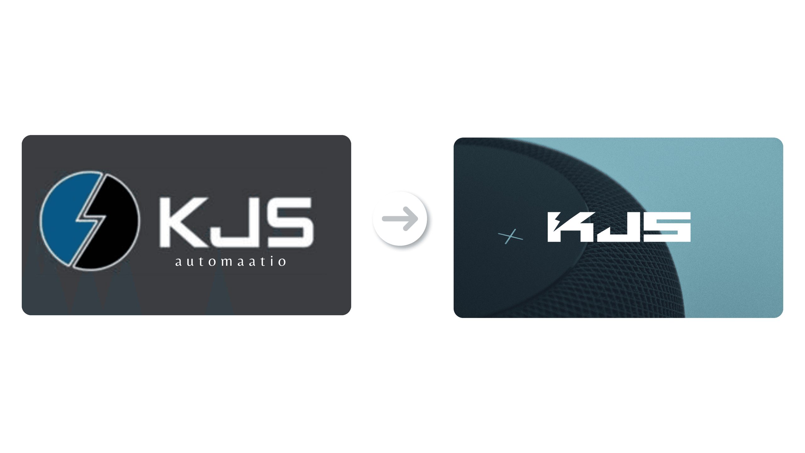
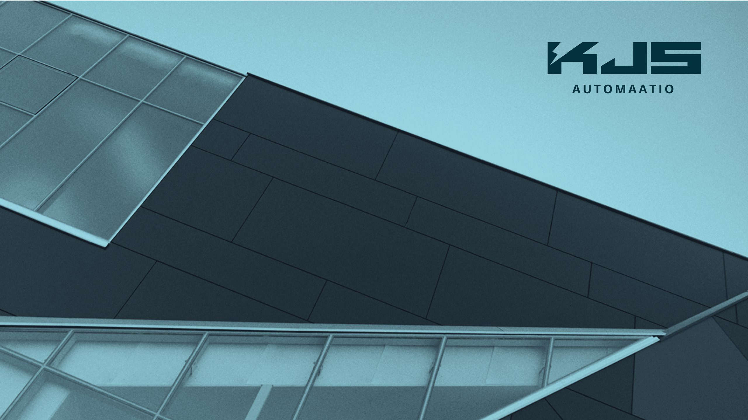
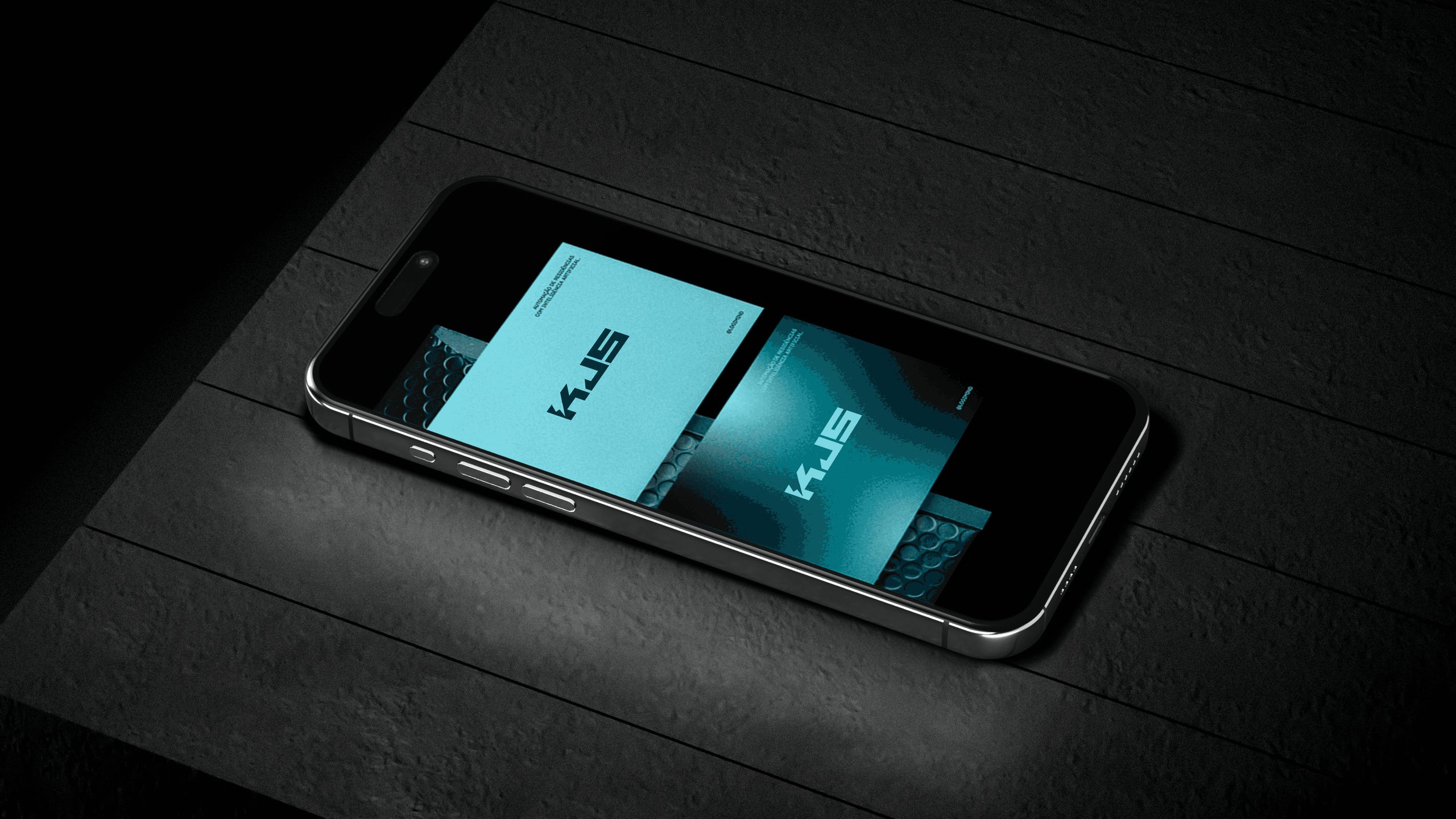
I updated KJS-Automaatio's logo, colors, typography and graphic elements. I wanted the new identity to reflect the company's technical expertise and reliability through a clear, industrial look. The images show how it works on an envelope, a form and a phone screen.
Logo, lightning bolt and colors
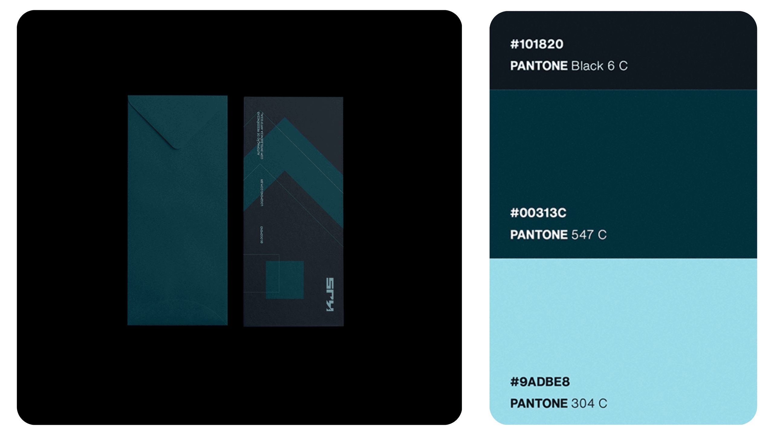
I kept the lightning bolt from the old logo, redrew it in a simpler form and removed the blue circle. The palette uses near-black, dark petrol blue and light blue, specified in Pantone shades (Black 6 C, 547 C and 304 C) for accurate printing. The typography and graphic elements use straight lines and industrial shapes.
Tell me about your project. Let's talk about how I can help.
You'll find the prices on the pricing page. In a 15-minute call, we'll go over what you need and when you need it.
Page updated October 26, 2026.